
ui.igShapeChart
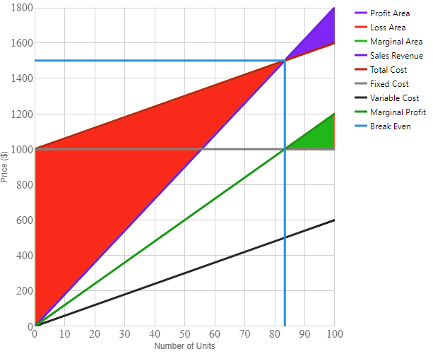
The igShapeChart is a lightweight, highly performant chart. This chart can be easily configured to display numeric or shapefile data using an extremely simple and intuitive API. All you need to do is bind your data (a collection or a collection of collections) and the chart takes care of everything else.
The following code snippet demonstrates how to initialize the igShapeChart control.
For details on how to reference the required scripts and themes for the igShapeChart control read, Using JavaScript Resources in Ignite UI and Styling and Theming Ignite UI.
Code Sample
      <!DOCTYPE html>
      <html>
      <head>
        <title>Ignite UI igShapeChart</title>

        <script src="https://igniteui.com/js/modernizr.min.js"></script>
        <script src="https://code.jquery.com/jquery-1.9.1.min.js"></script>
        <script src="https://code.jquery.com/ui/1.10.3/jquery-ui.min.js"></script>

        <link href="css/themes/infragistics/infragistics.theme.css" rel="stylesheet" />
        <link href="css/structure/modules/infragistics.ui.shared.css" rel="stylesheet" />
        <link href="css/structure/modules/infragistics.ui.chart.css" rel="stylesheet" />
	      <link href="css/structure/modules/infragistics.ui.shapechart.css" rel="stylesheet" />

        <script src="js/infragistics.core.js"></script>
        <script src="js/infragistics.dv.js"></script>

      </head>

      <body>

      <style>
          div
        {
            display: inline-block;
            vertical-align: top
        }
      </style>


      <div id="shapeChart"></div>
      <div id="legend"></div>

      <script>

            var data = [
            {
                "Units": 100, "Revenue": 1800, "VariableCost": 600, "FixedCost": 1000,
            }];

         $(function () {
            $("#shapeChart").igShapeChart({
                dataSource: data,
				        thickness: 3,
                width: "500px",
                height: "500px",
                yAxisTitle: "Price ($)",
                xAxisTitle: "Number of Units",
                brushes: ["#7F2AFA", "#FF3100", "#02B602", "#7222E7", "#C62600", "#808080", "#282828", "#029802", "#078FE4"],
                legend: $("#legend")
            });

            $("#legend").igChartLegend({});
        });

      </script>

      </body>

</html>
Related Samples
Related Topics
Dependencies
Inherits
-
alignsGridLinesToPixels
- Type:
- bool
- Default:
- true
Gets or sets a value indicating whether grid and tick lines are aligned to device pixels.
-
bottomMargin
- Type:
- number
- Default:
- NaN
Gets or sets the bottom margin around the chart content.
-
brushes
- Type:
- object
- Default:
- null
Gets or sets the palette of brushes to use for coloring the chart series.
The value provided should be an array of CSS color strings or JavaScript objects defining gradients. Optionally the first element can be a string reading "RGB" or "HSV" to specify the interpolation mode of the collection
The value provided should be an array of css color strings or JavaScript objects defining gradients. Optionally the first element can be a string reading "RGB" or "HSV" to specify the interpolation mode of the collection. -
chartType
- Type:
- enumeration
- Default:
- null
Gets or sets the type of chart series to generate from the data.
Members
- auto
- Type:string
- Specifies automatic selection of chart type based on suggestion from internal Data Adapter.
- point
- Type:string
- Specifies point chart with small markers at X/Y data.
- line
- Type:string
- Specifies line chart with small markers at X/Y data and connected with lines.
- spline
- Type:string
- Specifies spline chart with small markers at X/Y data and connected with splines.
- bubble
- Type:string
- Specifies bubble chart with proportional markers at X/Y data.
- highDensity
- Type:string
- Specifies high density chart with colored bitmap pixels at X/Y data based on density of nearby points.
- area
- Type:string
- Specifies area chart with colored surface based on a triangulation of X/Y data with numeric values assigned to each point.
- contour
- Type:string
- Specifies area chart with colored lines based on a triangulation of X/Y data with numeric values assigned to each point.
- polygon
- Type:string
- Specifies polygon chart with polygons defined by X/Y data.
- polyline
- Type:string
- Specifies polyline chart with polylines defined by X/Y data.
-
createWrappedTooltip
- Type:
- object
- Default:
- null
Gets or sets a function for creating wrapped tooltip.
-
databaseSource
- Type:
- string
- Default:
- null
String The database source URI.
-
dataSource
Inherited- Type:
- object
- Default:
- null
Gets sets a valid data source.
That can be instance of array or primitives, array of objects, instance of $.ig.DataSource, or any other data accepted by $.ig.DataSource.
Note: if it is set to string and "dataSourceType" option is not set, then $.ig.JSONPDataSource is used.Code Sample
// Given the following data... var data = [ { "X": 30, "Y": 30, "R": 10, "Value": 10 }, { "X": 30, "Y": 70, "R": 40, "Value": 10 }, { "X": 70, "Y": 70, "R": 40, "Value": 90 }, { "X": 70, "Y": 30, "R": 10, "Value": 90 }] // Initialize $(".selector").igShapeChart({ dataSource: data }); // Get var dataSource = $(".selector").igShapeChart("option", "dataSource"); // Set $(".selector").igShapeChart("option", "dataSource", data); -
dataSourceType
Inherited- Type:
- string
- Default:
- null
Gets sets data source type (such as "json", "xml", etc). Please refer to the documentation of $.ig.DataSource and its type property.
-
dataSourceUrl
Inherited- Type:
- string
- Default:
- null
Gets sets url which is used for sending JSON on request for remote data.
-
excludedProperties
- Type:
- object
- Default:
- null
Gets or sets a set of property paths that should be excluded from consideration by the category chart.
-
height
Inherited- Type:
- number
- Default:
- null
The height of the chart.
-
includedProperties
- Type:
- object
- Default:
- null
Gets or sets a set of property paths that should be included for consideration by the category chart, leaving the remainder excluded. If null, all properties will be considered.
-
isHorizontalZoomEnabled
- Type:
- bool
- Default:
- true
Gets or sets whether the chart can be horizontally zoomed through user interactions.
-
isVerticalZoomEnabled
- Type:
- bool
- Default:
- true
Gets or sets whether the chart can be vertically zoomed through user interactions.
-
itemsSource
- Type:
- object
- Default:
- null
Gets or sets a collection of data items used to generate the chart.
The ItemsSource of this chart can be a list of objects containing one or more numeric properties.
Additionally, if the objects in the list implement the IEnumerable interface,
the Chart will attempt to delve into the sub-collections when reading through the data source.
Databinding can be further configured by attributing the data item classes
with the DataSeriesMemberIntentAttribute. -
leftMargin
- Type:
- number
- Default:
- NaN
Gets or sets the left margin of the chart content.
-
legend
- Type:
- object
- Default:
- null
Gets or sets the legend to connect this chart to.
When the legend property is set, the chart will use it to display information about its series. Legends can be shared by multiple chart controls. -
markerBrushes
- Type:
- object
- Default:
- null
Gets or sets the palette of brushes used for rendering fill area of data point markers.
This property applies only to these chart types: point, line, spline, bubble, and polygon
The value provided should be an array of css color strings or JavaScript objects defining gradients. Optionally the first element can be a string reading "RGB" or "HSV" to specify the interpolation mode of the collection. -
markerCollision
- Type:
- enumeration
- Default:
- null
Gets or sets collision avoidance between markers on series that support this behaviour.
Members
- none
- Type:string
- Collision avoidance is disabled.
- omit
- Type:string
- Items colliding with other items will be hidden from view.
- fade
- Type:string
- Items colliding with other items will be partially hidden from view by reducing their opacity.
- omitAndShift
- Type:string
- Items colliding with other items will be either hidden from view or moved to new positions.
- fadeAndShift
- Type:string
- Items colliding with other items will be either partially hidden from view by reducing their opacity, or moved to new positions, or a combination of both.
-
markerMaxCount
- Type:
- number
- Default:
- 400
Gets or sets the maximum number of markers displyed in the plot area of the chart.
-
markerOutlines
- Type:
- object
- Default:
- null
Gets or sets the palette of brushes used for rendering outlines of data point markers.
This property applies only to these chart types: point, line, spline, bubble, and polygon
The value provided should be an array of css color strings or JavaScript objects defining gradients. Optionally the first element can be a string reading "RGB" or "HSV" to specify the interpolation mode of the collection. -
markerTypes
- Type:
- object
- Default:
- null
Gets or sets the marker shapes used for indicating location of data points in this chart.
This property applies only to these chart types: point, line, spline, bubble, and polygon. -
maxRecCount
Inherited- Type:
- number
- Default:
- 0
Gets sets maximum number of displayed records in chart.
-
outlines
- Type:
- object
- Default:
- null
Gets or sets the palette of brushes to use for outlines on the chart series.
The value provided should be an array of CSS color strings or JavaScript objects defining gradients. Optionally the first element can be a string reading "RGB" or "HSV" to specify the interpolation mode of the collection
The value provided should be an array of css color strings or JavaScript objects defining gradients. Optionally the first element can be a string reading "RGB" or "HSV" to specify the interpolation mode of the collection. -
resolution
- Type:
- number
- Default:
- 1
Gets or sets the rendering resolution for all series in this chart.
Where n = Resolution, for every n horizontal pixels, combine all items into a single datapoint. When Resolution = 0, all datapoints will be rendered as graphical objects. Charts with a higher resolution will have faster performance. -
responseDataKey
Inherited- Type:
- string
- Default:
- null
See $.ig.DataSource. This is basically the property in the responses where data records are held, if the response is wrapped.
-
responseTotalRecCountKey
Inherited- Type:
- string
- Default:
- null
See $.ig.DataSource. property in the response specifying the total number of records on the server.
-
rightMargin
- Type:
- number
- Default:
- NaN
Gets or sets the right margin of the chart content.
-
shapeDataSource
- Type:
- string
- Default:
- null
The triangulated file source URI or an instance of $.ig.ShapeDataSource.
-
subtitle
- Type:
- string
- Default:
- null
Gets or sets text to display below the Title, above the plot area.
-
subtitleAlignment
- Type:
- enumeration
- Default:
- center
Gets or sets horizontal alignment which determines the subtitle position, relative to the left and right edges of the control.
Members
- left
- Type:string
- Align the item to the left.
- center
- Type:string
- Center the item.
- right
- Type:string
- Align the item to the right.
- stretch
- Type:string
- Stretch the item to the full width.
-
subtitleBottomMargin
- Type:
- number
- Default:
- 0
Gets or sets the bottom margin of chart subtitle.
-
subtitleLeftMargin
- Type:
- number
- Default:
- 0
Gets or sets the left margin of chart subtitle.
-
subtitleRightMargin
- Type:
- number
- Default:
- 0
Gets or sets the right margin of chart subtitle.
-
subtitleTextColor
- Type:
- string
- Default:
- null
Gets or sets color of chart subtitle.
-
subtitleTextStyle
- Type:
- string
- Default:
- null
Gets or sets CSS font property for the chart subtitle.
-
subtitleTopMargin
- Type:
- number
- Default:
- 0
Gets or sets the top margin of chart subtitle.
-
thickness
- Type:
- number
- Default:
- 1
Gets or sets the thickness for all series in this chart. Depending on the ChartType, this can be the main brush used, or just the outline.
-
title
- Type:
- string
- Default:
- null
Gets or sets text to display above the plot area.
-
titleAlignment
- Type:
- enumeration
- Default:
- center
Gets or sets horizontal alignment which determines the title position, relative to the left and right edges of the control.
Members
- left
- Type:string
- Align the item to the left.
- center
- Type:string
- Center the item.
- right
- Type:string
- Align the item to the right.
- stretch
- Type:string
- Stretch the item to the full width.
-
titleBottomMargin
- Type:
- number
- Default:
- 0
Gets or sets the bottom margin of chart title.
-
titleLeftMargin
- Type:
- number
- Default:
- 0
Gets or sets the left margin of chart title.
-
titleRightMargin
- Type:
- number
- Default:
- 0
Gets or sets the right margin of chart title.
-
titleTextColor
- Type:
- string
- Default:
- null
Gets or sets color of chart title.
-
titleTextStyle
- Type:
- string
- Default:
- null
Gets or sets CSS font property for the chart title.
-
titleTopMargin
- Type:
- number
- Default:
- 0
Gets or sets the top margin of chart title.
-
tooltipTemplate
- Type:
- object
- Default:
- null
Gets or sets the id of a template element to use for tooltips, or markup representing the tooltip template.
-
tooltipTemplates
- Type:
- object
- Default:
- null
Gets or sets the names of tooltip templates.
-
topMargin
- Type:
- number
- Default:
- NaN
Gets or sets the top margin of the chart content.
-
transitionDuration
- Type:
- number
- Default:
- 0
Gets or sets the duration used for animating series plots when the data is changing.
-
transitionEasingFunction
- Type:
- object
- Default:
- null
Gets or sets the easing function used for animating series plots when the data is changing.
This can be set to one of the known values "linear" or "cubic," or it can be set to an easing function which takes a single numeric parameter and returns a number. -
trendLineBrushes
- Type:
- object
- Default:
- null
Gets or sets the palette of brushes to used for coloring trend lines in this chart.
The value provided should be an array of CSS color strings or JavaScript objects defining gradients. Optionally the first element can be a string reading "RGB" or "HSV" to specify the interpolation mode of the collection
The value provided should be an array of css color strings or JavaScript objects defining gradients. Optionally the first element can be a string reading "RGB" or "HSV" to specify the interpolation mode of the collection. -
trendLinePeriod
- Type:
- number
- Default:
- 7
-
trendLineThickness
- Type:
- number
- Default:
- 1.5
Gets or sets the thickness of the trend lines in this chart.
This property applies only to these chart types: point, line, spline, and bubble. -
trendLineType
- Type:
- enumeration
- Default:
- null
Gets or sets the formula used for calculating trend lines in this chart. This property applies only to these chart types: point, line, spline, and bubble.
Members
- none
- Type:string
- No trend line will be displayed.
- linearFit
- Type:string
- Linear fit.
- quadraticFit
- Type:string
- Quadratic polynomial fit.
- cubicFit
- Type:string
- Cubic polynomial fit.
- quarticFit
- Type:string
- Quartic polynomial fit.
- quinticFit
- Type:string
- Quintic polynomial fit.
- logarithmicFit
- Type:string
- Logarithmic fit.
- exponentialFit
- Type:string
- Exponential fit.
- powerLawFit
- Type:string
- Powerlaw fit.
- simpleAverage
- Type:string
- Simple moving average.
- exponentialAverage
- Type:string
- Exponential moving average.
- modifiedAverage
- Type:string
- Modified moving average.
- cumulativeAverage
- Type:string
- Cumulative moving average.
- weightedAverage
- Type:string
- Weighted moving average.
-
triangulationDataSource
- Type:
- string
- Default:
- null
The triangulated file source URI or an instance of $.ig.TriangulationDataSource.
-
unknownValuePlotting
- Type:
- enumeration
- Default:
- null
Gets or sets the behavior that determines how unknown values will be plotted on the chart. Null and Double.NaN are two examples of unknown values.
Members
- linearInterpolate
- Type:string
- Plot the unknown value as the midpoint between surrounding known values using linear interpolation.
- dontPlot
- Type:string
- Do not plot the unknown value on the chart.
-
widget
- Type:
- object
- Default:
- null
Gets or sets the widget of this control.
-
width
Inherited- Type:
- number
- Default:
- null
The width of the chart.
-
windowRect
- Type:
- object
- Default:
- null
Gets or sets the rectangle representing the current scroll and zoom state of the chart.
WindowRect is expressed as a Rectangle with coordinates and sizes between 0 and 1.
The provided object should have numeric properties called left, top, width and height. -
xAxisAbbreviateLargeNumbers
- Type:
- bool
- Default:
- true
Gets or sets whether the large numbers on the X-axis labels are abbreviated.
-
xAxisExtent
- Type:
- number
- Default:
- NaN
Gets or sets the distance between the X-axis and the bottom of the chart.
-
xAxisFormatLabel
- Type:
- object
- Default:
- null
Gets or sets function which takes an context object and returns a formatted label for the X-axis.
-
xAxisInterval
- Type:
- number
- Default:
- 0
Gets or sets the frequency of displayed labels along the X-axis.
Gets or sets the set value is a factor that determines which labels will be hidden. For example, an interval of 2 will display every other label. -
xAxisInverted
- Type:
- bool
- Default:
- false
Gets or sets whether to invert the direction of the X-axis by placing the first data items on the right side of the chart.
-
xAxisIsLogarithmic
- Type:
- bool
- Default:
- false
Gets or sets whether the X-axis will use a logarithmic scale, instead of a linear one.
Since log(-1) is imaginary and log(0) is undefined, it is recommended to enable this property only when the X-axis minimum is greater than zero. -
xAxisLabel
- Type:
- object
- Default:
- null
Gets or sets the format for labels along the X-axis.
-
xAxisLabelAngle
- Type:
- number
- Default:
- 0
Gets or sets the angle of rotation for labels along the X-axis.
-
xAxisLabelBottomMargin
- Type:
- number
- Default:
- 5
Gets or sets the bottom margin of labels on the X-axis.
-
xAxisLabelHorizontalAlignment
- Type:
- enumeration
- Default:
- center
Gets or sets Horizontal alignment of X-axis labels.
Members
- left
- Type:string
- Align the item to the left.
- center
- Type:string
- Center the item.
- right
- Type:string
- Align the item to the right.
- stretch
- Type:string
- Stretch the item to the full width.
-
xAxisLabelLeftMargin
- Type:
- number
- Default:
- 0
Gets or sets the left margin of labels on the X-axis.
-
xAxisLabelRightMargin
- Type:
- number
- Default:
- 0
Gets or sets the right margin of labels on the X-axis.
-
xAxisLabelTextColor
- Type:
- string
- Default:
- null
Gets or sets color of labels on the X-axis.
-
xAxisLabelTextStyle
- Type:
- string
- Default:
- null
Gets or sets CSS font property for labels on X-axis.
-
xAxisLabelTopMargin
- Type:
- number
- Default:
- 5
Gets or sets the top margin of labels on the X-axis.
-
xAxisLabelVerticalAlignment
- Type:
- enumeration
- Default:
- top
Gets or sets Vertical alignment of X-axis labels.
Members
- top
- Type:string
- Align the item to the top.
- center
- Type:string
- Center the item.
- bottom
- Type:string
- Align the item to the bottom.
- stretch
- Type:string
- Stretch the item to the full height.
-
xAxisLabelVisibility
- Type:
- enumeration
- Default:
- null
Gets or sets Visibility of X-axis labels.
Members
- visible
- Type:string
- Display the element.
- collapsed
- Type:string
- Do not display the element.
-
xAxisLogarithmBase
- Type:
- number
- Default:
- 0
Gets or sets the base value to use in the log function when mapping the position of data items along the X-axis.
This property is effective only when y-axis is logarithmic. -
xAxisMajorStroke
- Type:
- string
- Default:
- null
Gets or sets the color to apply to major gridlines along the X-axis.
-
xAxisMajorStrokeThickness
- Type:
- number
- Default:
- 1
Gets or sets the thickness to apply to major gridlines along the X-axis.
-
xAxisMaximumValue
- Type:
- number
- Default:
- NaN
Gets or sets the data value corresponding to the maximum value on the X-axis.
-
xAxisMinimumValue
- Type:
- number
- Default:
- NaN
Gets or sets the data value corresponding to the minimum value on the X-axis.
-
xAxisMinorInterval
- Type:
- number
- Default:
- 0
Gets or sets the frequency of displayed minor lines along the X-axis.
Gets or sets the set value is a factor that determines how the minor lines will be displayed. -
xAxisMinorStroke
- Type:
- string
- Default:
- null
Gets or sets the color to apply to minor gridlines along the X-axis.
-
xAxisMinorStrokeThickness
- Type:
- number
- Default:
- 1
Gets or sets the thickness to apply to minor gridlines along the X-axis.
-
xAxisStrip
- Type:
- string
- Default:
- null
Gets or sets the color to apply to stripes along the X-axis.
-
xAxisStroke
- Type:
- string
- Default:
- null
Gets or sets the color to apply to the X-axis line.
-
xAxisStrokeThickness
- Type:
- number
- Default:
- 1
Gets or sets the thickness to apply to the X-axis line.
-
xAxisTickLength
- Type:
- number
- Default:
- 5
Gets or sets the length of tickmarks along the X-axis.
-
xAxisTickStroke
- Type:
- string
- Default:
- null
Gets or sets the color to apply to tickmarks along the X-axis.
-
xAxisTickStrokeThickness
- Type:
- number
- Default:
- 2
Gets or sets the thickness to apply to tickmarks along the X-axis.
-
xAxisTitle
- Type:
- string
- Default:
- null
Gets or sets the Text to display below the X-axis.
-
xAxisTitleAlignment
- Type:
- enumeration
- Default:
- center
Gets or sets Horizontal alignment of the X-axis title.
Members
- left
- Type:string
- Align the item to the left.
- center
- Type:string
- Center the item.
- right
- Type:string
- Align the item to the right.
- stretch
- Type:string
- Stretch the item to the full width.
-
xAxisTitleAngle
- Type:
- number
- Default:
- 0
Gets or sets the angle of rotation for the X-axis title.
-
xAxisTitleBottomMargin
- Type:
- number
- Default:
- NaN
Gets or sets the bottom margin of a title on the X-axis.
-
xAxisTitleLeftMargin
- Type:
- number
- Default:
- NaN
Gets or sets the left margin of a title on the X-axis.
-
xAxisTitleMargin
- Type:
- number
- Default:
- 0
Gets or sets the margin around a title on the X-axis.
-
xAxisTitleRightMargin
- Type:
- number
- Default:
- NaN
Gets or sets the right margin of a title on the X-axis.
-
xAxisTitleTextColor
- Type:
- string
- Default:
- null
Gets or sets color of title on the X-axis.
-
xAxisTitleTextStyle
- Type:
- string
- Default:
- null
Gets or sets CSS font property for title on X-axis.
-
xAxisTitleTopMargin
- Type:
- number
- Default:
- NaN
Gets or sets the top margin of a title on the X-axis.
-
yAxisAbbreviateLargeNumbers
- Type:
- bool
- Default:
- true
Gets or sets whether the large numbers on the Y-axis labels are abbreviated.
-
yAxisExtent
- Type:
- number
- Default:
- NaN
Gets or sets the distance between the Y-axis and the left edge of the chart.
-
yAxisFormatLabel
- Type:
- object
- Default:
- null
Gets or sets function which takes a context object and returns a formatted label for the Y-axis.
-
yAxisInterval
- Type:
- number
- Default:
- 0
Gets or sets the distance between each label and grid line along the Y-axis.
-
yAxisInverted
- Type:
- bool
- Default:
- false
Gets or sets whether to invert the direction of the Y-axis by placing the minimum numeric value at the top of the chart.
-
yAxisIsLogarithmic
- Type:
- bool
- Default:
- false
Gets or sets whether the Y-axis should use a logarithmic scale instead of a linear one.
Since log(-1) is imaginary and log(0) is undefined, it is recommended to enable this property only when the Y-axis minimum is greater than zero. -
yAxisLabel
- Type:
- object
- Default:
- null
Gets or sets the format for labels along the Y-axis.
-
yAxisLabelAngle
- Type:
- number
- Default:
- 0
Gets or sets the angle of rotation for labels along the Y-axis.
-
yAxisLabelBottomMargin
- Type:
- number
- Default:
- 0
Gets or sets the bottom margin of labels on the Y-axis.
-
yAxisLabelHorizontalAlignment
- Type:
- enumeration
- Default:
- right
Gets or sets Horizontal alignment of Y-axis labels.
Members
- left
- Type:string
- Align the item to the left.
- center
- Type:string
- Center the item.
- right
- Type:string
- Align the item to the right.
- stretch
- Type:string
- Stretch the item to the full width.
-
yAxisLabelLeftMargin
- Type:
- number
- Default:
- 5
Gets or sets the left margin of labels on the Y-axis.
-
yAxisLabelLocation
- Type:
- enumeration
- Default:
- outsideLeft
The location of Y-axis labels, relative to the plot area.
Members
- outsideTop
- Type:string
- Places the axis labels at the top, outside of the plotting area.
- outsideBottom
- Type:string
- Places the axis labels at the bottom, outside of the plotting area.
- outsideLeft
- Type:string
- Places the axis labels to the left, outside of the plotting area.
- outsideRight
- Type:string
- Places the axis labels to the right, outside of the plotting area.
- insideTop
- Type:string
- Places the axis labels inside the plotting area above the axis line.
- insideBottom
- Type:string
- Places the axis labels inside the plotting area below the axis line.
- insideLeft
- Type:string
- Places the axis labels inside the plotting area and to the left of the axis line.
- insideRight
- Type:string
- Places the axis labels inside the plotting area and to the right of the axis line.
-
yAxisLabelRightMargin
- Type:
- number
- Default:
- 5
Gets or sets the right margin of labels on the Y-axis.
-
yAxisLabelTextColor
- Type:
- string
- Default:
- null
Gets or sets color of labels on the Y-axis.
-
yAxisLabelTextStyle
- Type:
- string
- Default:
- null
Gets or sets CSS font property for labels on Y-axis.
-
yAxisLabelTopMargin
- Type:
- number
- Default:
- 0
Gets or sets the top margin of labels on the Y-axis.
-
yAxisLabelVerticalAlignment
- Type:
- enumeration
- Default:
- center
Gets or sets Vertical alignment of Y-axis labels.
Members
- top
- Type:string
- Align the item to the top.
- center
- Type:string
- Center the item.
- bottom
- Type:string
- Align the item to the bottom.
- stretch
- Type:string
- Stretch the item to the full height.
-
yAxisLabelVisibility
- Type:
- enumeration
- Default:
- null
Gets or sets Visibility of Y-axis labels.
Members
- visible
- Type:string
- Display the element.
- collapsed
- Type:string
- Do not display the element.
-
yAxisLogarithmBase
- Type:
- number
- Default:
- 0
Gets or sets the base value to use in the log function when mapping the position of data items along the Y-axis.
This property is effective only when YAxisIsLogarithmic is true. -
yAxisMajorStroke
- Type:
- string
- Default:
- null
Gets or sets the color to apply to major gridlines along the Y-axis.
-
yAxisMajorStrokeThickness
- Type:
- number
- Default:
- 1
Gets or sets the thickness to apply to major gridlines along the Y-axis.
-
yAxisMaximumValue
- Type:
- number
- Default:
- NaN
Gets or sets the data value corresponding to the maximum value of the Y-axis.
-
yAxisMinimumValue
- Type:
- number
- Default:
- NaN
Gets or sets the data value corresponding to the minimum value of the Y-axis.
-
yAxisMinorInterval
- Type:
- number
- Default:
- 0
Gets or sets the frequency of displayed minor lines along the Y-axis.
-
yAxisMinorStroke
- Type:
- string
- Default:
- null
Gets or sets the color to apply to minor gridlines along the Y-axis.
-
yAxisMinorStrokeThickness
- Type:
- number
- Default:
- 0
Gets or sets the thickness to apply to minor gridlines along the Y-axis.
-
yAxisStrip
- Type:
- string
- Default:
- null
Gets or sets the color to apply to stripes along the Y-axis.
-
yAxisStroke
- Type:
- string
- Default:
- null
Gets or sets the color to apply to the Y-axis line.
-
yAxisStrokeThickness
- Type:
- number
- Default:
- 1
Gets or sets the thickness to apply to the Y-axis line.
-
yAxisTickLength
- Type:
- number
- Default:
- 0
Gets or sets the length of tickmarks along the Y-axis.
-
yAxisTickStroke
- Type:
- string
- Default:
- null
Gets or sets the color to apply to tickmarks along the Y-axis.
-
yAxisTickStrokeThickness
- Type:
- number
- Default:
- 2
Gets or sets the thickness to apply to tickmarks along the Y-axis.
-
yAxisTitle
- Type:
- string
- Default:
- null
Gets or sets the Text to display to the left of the Y-axis.
-
yAxisTitleAlignment
- Type:
- enumeration
- Default:
- center
Gets or sets Vertical alignment of the Y-axis title.
Members
- top
- Type:string
- Align the item to the top.
- center
- Type:string
- Center the item.
- bottom
- Type:string
- Align the item to the bottom.
- stretch
- Type:string
- Stretch the item to the full height.
-
yAxisTitleAngle
- Type:
- number
- Default:
- -90
Gets or sets the angle of rotation for the Y-axis title.
-
yAxisTitleBottomMargin
- Type:
- number
- Default:
- NaN
Gets or sets the bottom margin of a title on the Y-axis.
-
yAxisTitleLeftMargin
- Type:
- number
- Default:
- NaN
Gets or sets the left margin of a title on the Y-axis.
-
yAxisTitleMargin
- Type:
- number
- Default:
- 0
Gets or sets the margin around a title on the Y-axis.
-
yAxisTitleRightMargin
- Type:
- number
- Default:
- NaN
Gets or sets the right margin of a title on the Y-axis.
-
yAxisTitleTextColor
- Type:
- string
- Default:
- null
Gets or sets color of title on the Y-axis.
-
yAxisTitleTextStyle
- Type:
- string
- Default:
- null
Gets or sets CSS font property for title on Y-axis.
-
yAxisTitleTopMargin
- Type:
- number
- Default:
- NaN
Gets or sets the top margin of a title on the Y-axis.
For more information on how to interact with the Ignite UI controls' events, refer to
Using Events in Ignite UI.
-
dataBinding
Inherited- Cancellable:
- true
Event which is raised before data binding.
Return false in order to cancel data binding.
Function takes first argument null and second argument ui.
Use ui.owner to obtain reference to chart widget.
Use ui.dataSource to obtain reference to instance of $.ig.DataSource. -
dataBound
Inherited- Cancellable:
- false
Event which is raised after data binding.
Function takes first argument null and second argument ui.
Use ui.owner to obtain reference to chart widget.
Use ui.data to obtain reference to array actual data which is displayed by chart.
Use ui.dataSource to obtain reference to instance of $.ig.DataSource. -
hideTooltip
Inherited- Cancellable:
- true
Event which is raised before tooltip is hidden.
Return false in order to cancel hiding and keep tooltip visible.
Function takes first argument null and second argument ui.
Use ui.owner to obtain reference to chart widget.
Use ui.item to obtain reference to item.
Use ui.element to obtain reference to jquery object which represents tooltip or value of ui.element from last updateTooltip event. Value of that member can be replaced by custom element. -
propertyChanged
- Cancellable:
- false
Event raised when a property value is changed on this chart.
-
seriesAdded
- Cancellable:
- false
Event raised when a series is initialized and added to this chart.
-
seriesPointerDown
- Cancellable:
- false
Occurs when the pointer is pressed down over a Series.
-
seriesPointerEnter
- Cancellable:
- false
Occurs when the pointer enters a Series.
-
seriesPointerLeave
- Cancellable:
- false
Occurs when the pointer leaves a Series.
-
seriesPointerMove
- Cancellable:
- false
Occurs when the pointer moves over a Series.
-
seriesPointerUp
- Cancellable:
- false
Occurs when the pointer is released over a Series.
-
seriesRemoved
- Cancellable:
- false
Event raised when a series is removed from this chart.
-
updateTooltip
Inherited- Cancellable:
- true
Event which is raised before tooltip is updated.
Return false in order to cancel updating and hide tooltip.
Function takes first argument null and second argument ui.
Use ui.owner to obtain reference to chart widget.
Use ui.text to obtain html of tooltip. Value of that member can be modified. If modified value is null or empty string, then current content of tooltip keeps old value.
Use ui.item to obtain reference to item. Value of that member can be modified or replaced by custom item.
Use ui.x to obtain left position of tooltip in pixels relative to widget. Value of that member can be modified.
Use ui.y to obtain top position of tooltip in pixels relative to widget. Value of that member can be modified.
Use ui.element to obtain reference to jquery object which represents tooltip. Value of that member can be replaced by custom element.
-
addItem
Inherited- .igShapeChart( "addItem", item:object );
- Return Type:
- object
- Return Type Description:
- Returns a reference to this chart.
Adds a new item to the data source and notifies the chart.
- item
- Type:object
- The item that we want to add to the data source.
-
chart
Inherited- .igShapeChart( "chart" );
- Return Type:
- object
- Return Type Description:
- Returns reference to chart.
Get reference to chart object.
-
dataBind
Inherited- .igShapeChart( "dataBind" );
Binds data to the chart.
-
destroy
- .igShapeChart( "destroy" );
-
exportVisualData
- .igShapeChart( "exportVisualData" );
-
findIndexOfItem
Inherited- .igShapeChart( "findIndexOfItem", item:object );
- Return Type:
- number
- Return Type Description:
- Returns -1 or index of item.
Find index of item within actual data used by chart.
- item
- Type:object
- The reference to item.
-
flush
Inherited- .igShapeChart( "flush" );
Forces any pending deferred work to render on the chart before continuing.
-
getData
Inherited- .igShapeChart( "getData" );
- Return Type:
- array
- Return Type Description:
- Returns null or reference to data.
Get reference of actual data used by chart.
-
getDataItem
Inherited- .igShapeChart( "getDataItem", index:object );
- Return Type:
- object
- Return Type Description:
- Returns null or reference to data item.
Get item within actual data used by chart. That is similar to this.getData()[ index ].
- index
- Type:object
- Index of data item.
-
id
- .igShapeChart( "id" );
-
insertItem
Inherited- .igShapeChart( "insertItem", item:object, index:number );
- Return Type:
- object
- Return Type Description:
- Returns a reference to this chart.
Inserts a new item to the data source and notifies the chart.
- item
- Type:object
- the new item that we want to insert in the data source.
- index
- Type:number
- The index in the data source where the new item will be inserted.
-
notifyClearItems
Inherited- .igShapeChart( "notifyClearItems", dataSource:object );
- Return Type:
- object
- Return Type Description:
- Returns a reference to this chart.
Notifies the chart that the items have been cleared from an associated data source.
It's not necessary to notify more than one target of a change if they share the same items source.- dataSource
- Type:object
- The data source in which the change happened.
-
notifyInsertItem
Inherited- .igShapeChart( "notifyInsertItem", dataSource:object, index:number, newItem:object );
- Return Type:
- object
- Return Type Description:
- Returns a reference to this chart.
Notifies the target axis or series that an item has been inserted at the specified index in its data source.
It's not necessary to notify more than one target of a change if they share the same items source.- dataSource
- Type:object
- The data source in which the change happened.
- index
- Type:number
- The index in the items source where the new item has been inserted.
- newItem
- Type:object
- the new item that has been set in the collection.
-
notifyRemoveItem
Inherited- .igShapeChart( "notifyRemoveItem", dataSource:object, index:number, oldItem:object );
- Return Type:
- object
- Return Type Description:
- Returns a reference to this chart.
Notifies the target axis or series that an item has been removed from the specified index in its data source.
It's not necessary to notify more than one target of a change if they share the same items source.- dataSource
- Type:object
- The data source in which the change happened.
- index
- Type:number
- The index in the items source from where the old item has been removed.
- oldItem
- Type:object
- the old item that has been removed from the collection.
-
notifySetItem
Inherited- .igShapeChart( "notifySetItem", dataSource:object, index:number, newItem:object, oldItem:object );
- Return Type:
- object
- Return Type Description:
- Returns a reference to this chart.
Notifies the chart that an item has been set in an associated data source.
- dataSource
- Type:object
- The data source in which the change happened.
- index
- Type:number
- The index in the items source that has been changed.
- newItem
- Type:object
- the new item that has been set in the collection.
- oldItem
- Type:object
- the old item that has been overwritten in the collection.
-
removeItem
Inherited- .igShapeChart( "removeItem", index:number );
- Return Type:
- object
- Return Type Description:
- Returns a reference to this chart.
Deletes an item from the data source and notifies the chart.
- index
- Type:number
- The index in the data source from where the item will be been removed.
-
setItem
Inherited- .igShapeChart( "setItem", index:number, item:object );
- Return Type:
- object
- Return Type Description:
- Returns a reference to this chart.
Updates an item in the data source and notifies the chart.
- index
- Type:number
- The index of the item in the data source that we want to change.
- item
- Type:object
- The new item object that will be set in the data source.
-
ui-category ui-corner-all ui-widget-content ui-shapechart-container
- Get the class applied to main element: ui-category ui-corner-all ui-widget-content.
-
ui-category-tooltip ui-widget-content ui-corner-all
- Get the class applied to the tooltip element: ui-category-tooltip ui-widget-content ui-corner-all.
-
ui-html5-non-html5-supported-message ui-helper-clearfix ui-html5-non-html5
- Get the class applied to main element, shown when the chart is opened in a non HTML5 compatible browser.